With the work on todo-tracker coming along, and having a working Golang implementation, I'm going to start on the devpad rescope. The second step in this is a full redesign of the platform, with a focus on simplicity & application usefulness. I want to try and get the todo-tracker integration up and running as soon as possible.
Old Site Analysis
I'm going to try and break down my thought process when looking at the old website and identifying areas for improvement.
Landing Page
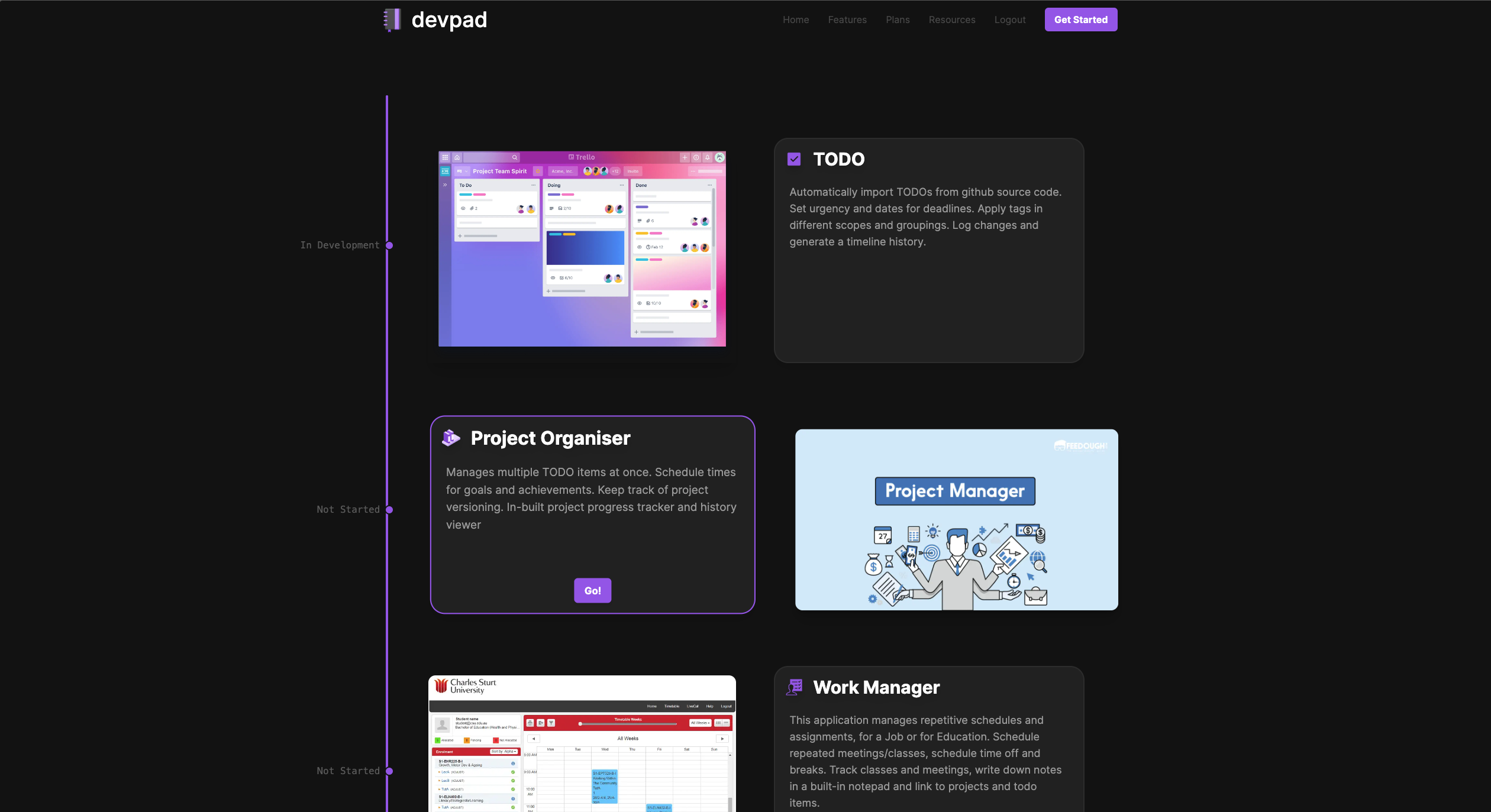 On the landing page there are really only 3 things that this page does. It gives the user a button to login/logout from, serves links for the various apps under devpad, and gives a brief description for each app. The other links at the top don’t actually go anywhere yet, and they don’t have a purpose. The development timeline was a good idea at first, but it really doesn’t belong on a landing page.
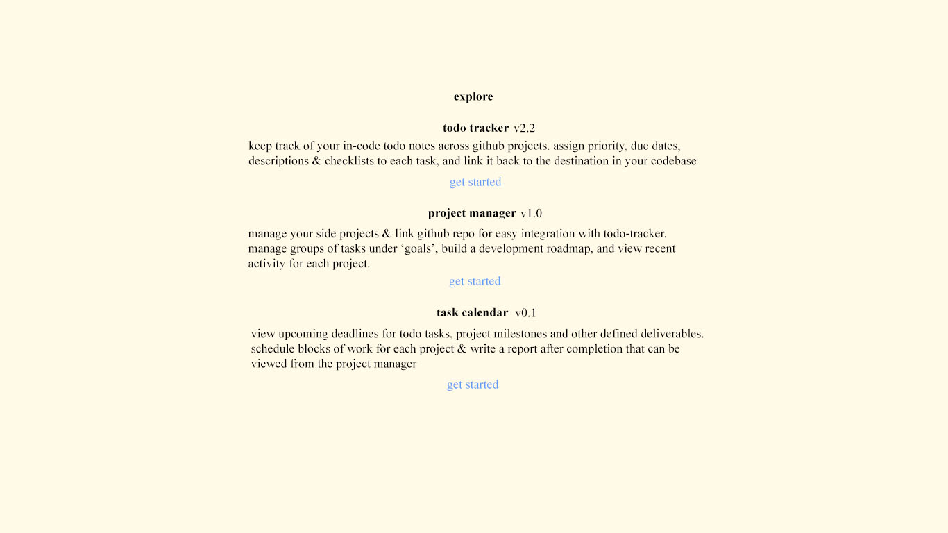
A landing page should serve a simplistic function, enticing the user to take one of a few actions. The previous landing page is a bad example of this. Firstly, you have to hover on each project to see the ‘Go’ button, which isn’t very enticing at first glance and bad for keyboard users. There’s also 3 different areas of attention that are competing, the ‘Get Started’ button, the project cards and the development timeline. Stripping back all these we really are left with 1 section, ‘Explore’. That’s all this page does, aside from offering a login button. If there was just one button, that then took you to a list of projects, that would be much more enticing and increase user interaction.
Project Manager Home
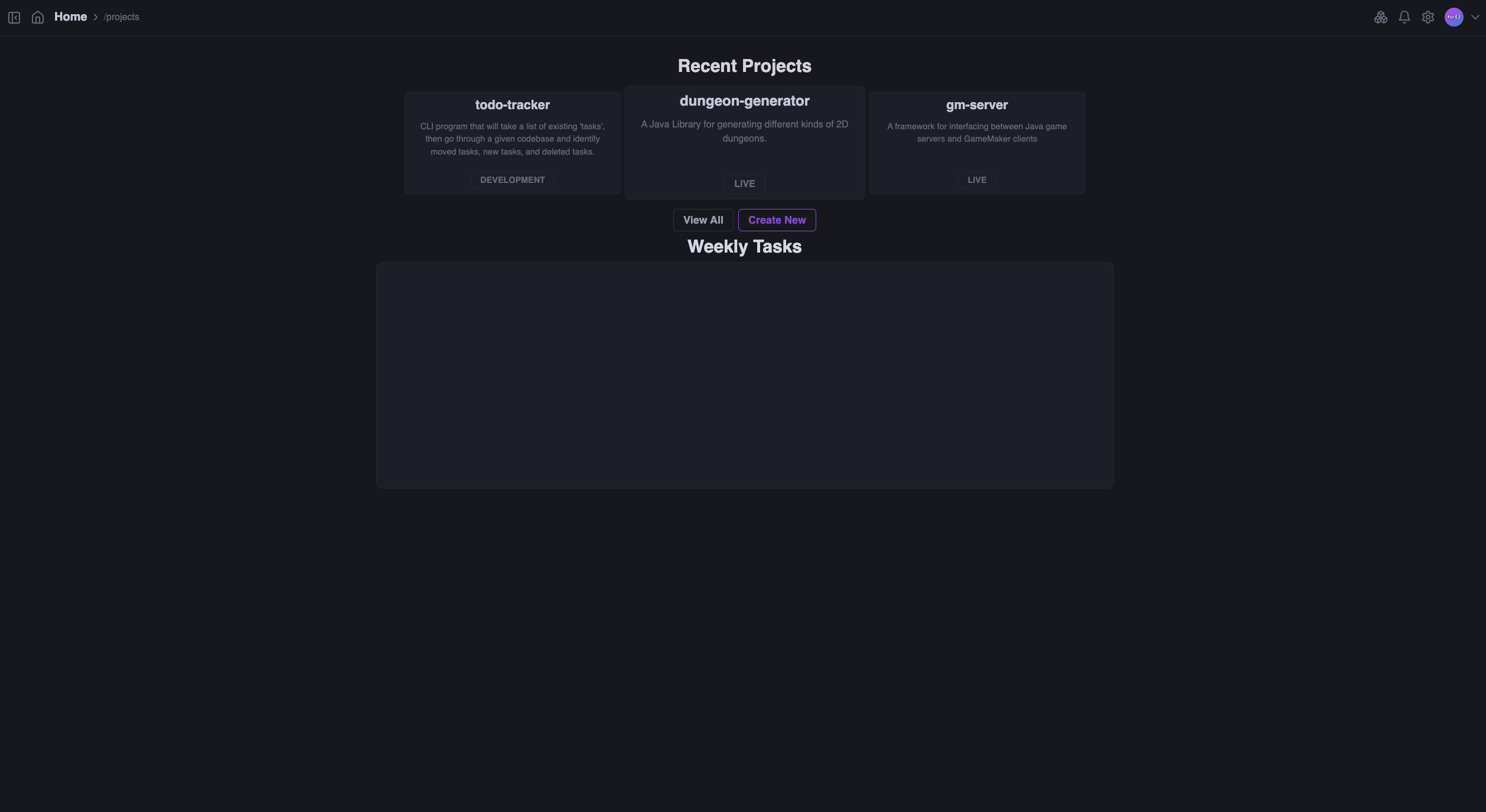 It’s a similar story for the project manager homepage. Obvisouly, weekly tasks was never implemented so it’s just blank at the moment. But there’s a lot of negative space here anyway. The chances that the project that the user wants to view is in the recent is better than showing the oldest 3, but we can fit all the projects on this page anyway in my case. It’s probably rare that the user would have more projects than I currently have, and if they do, then they probably wouldn’t care to scroll down a bit. Furthermore, we could reduce the information in the view all page. Currently there’s a large title, a subtle description and then a tag displaying the status: ‘DEVELOPMENT’, ‘LIVE’, ‘PAUSED’ etc.
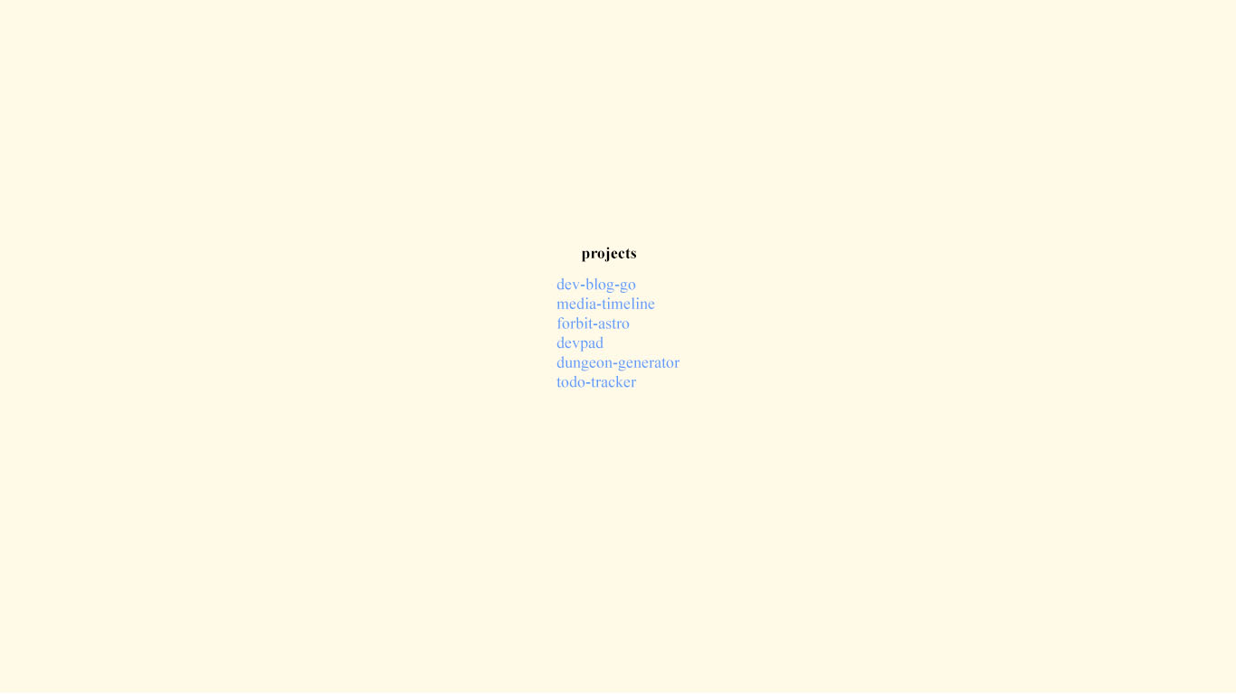
Given that it’s the users own projects, they likely know the description of their own projects, and the project status as well, so it doesn’t make much sense to display these. So if we were to strip each card down to just the title, we could fit many, many more projects, removing the need for a separate ‘view all’ page and simplifying the user experience.
Project Page
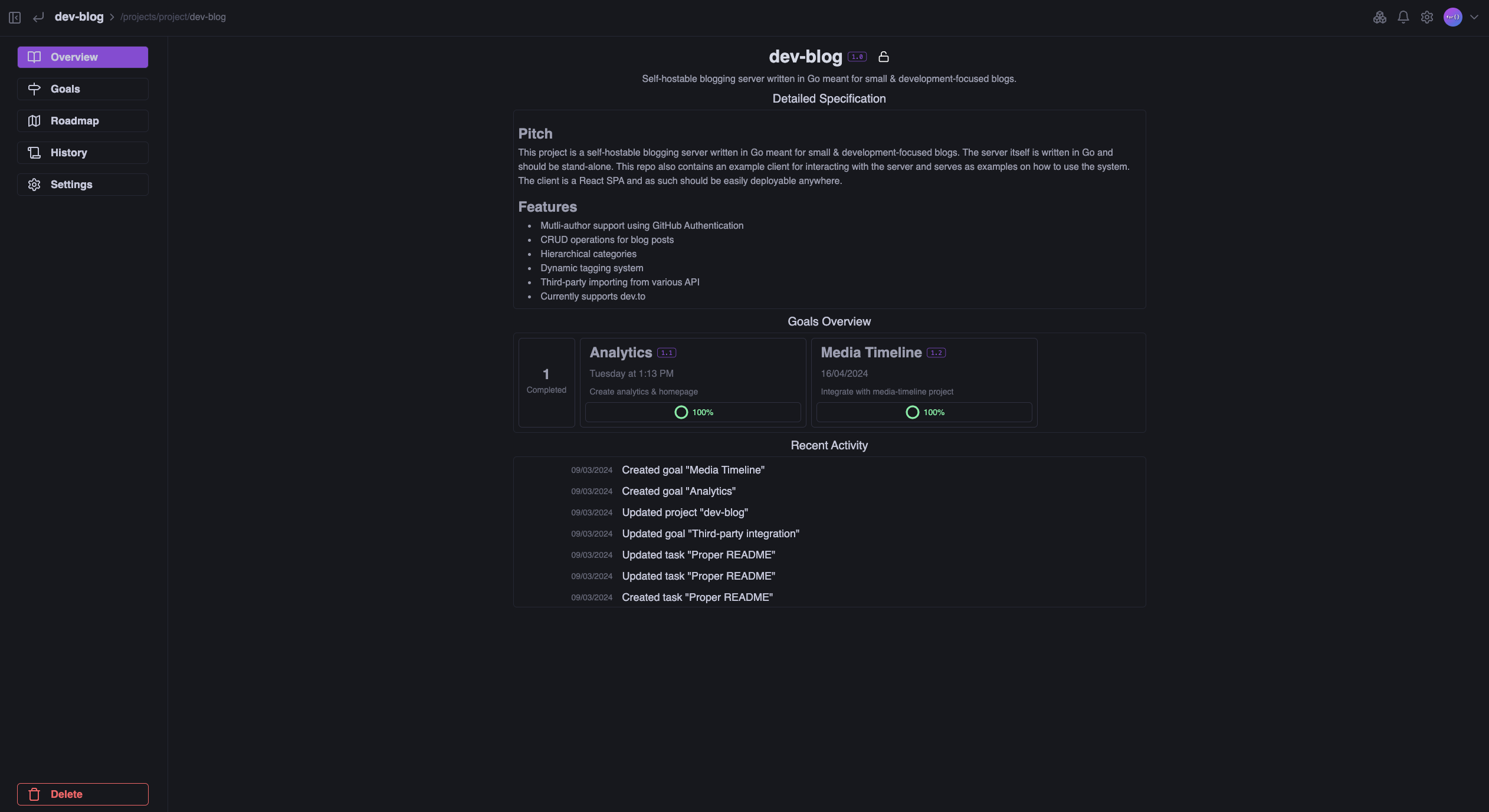 The projects page, which is one of the more recent developments is quite good in terms of usability and information. Something I would change would to move the delete button into settings. Deleting a project should be something intentional, it shouldn’t be available on the overview of the project itself. Perhaps the editing controls could be simplified, it’s quite inconsistent that the specification you can edit from this page, but everything else you must edit in settings.
New Site Design
Below are some mockups of what I'd like to have the new website to look like.
Landing Page
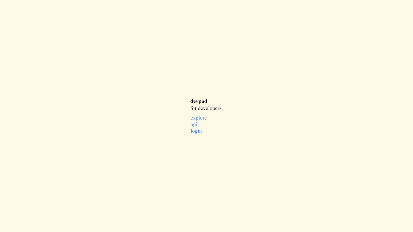
Explore Page
Project Manager
Project Page

Todo Tracker
I may go into the reasoning behind the design choices, inspirations, and main goals of the new design in a later post. For now, it's time to get coding.